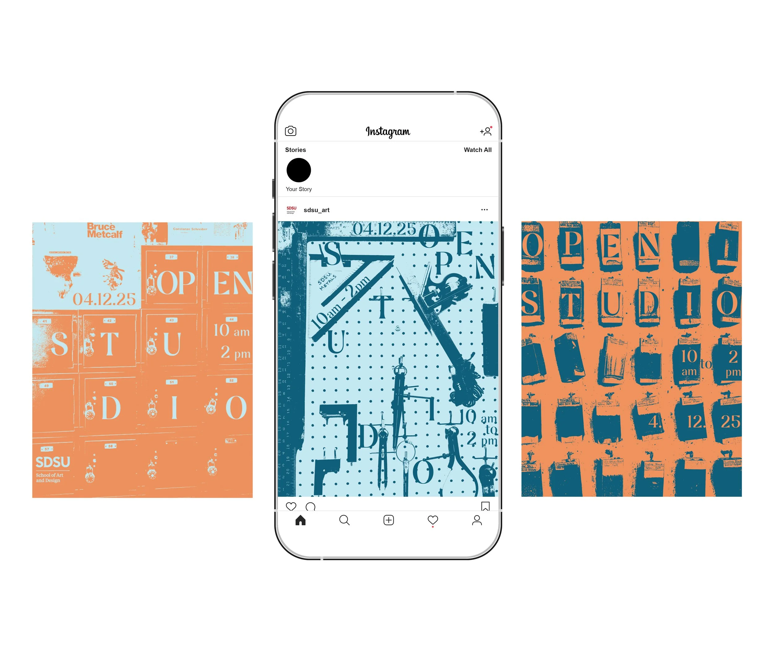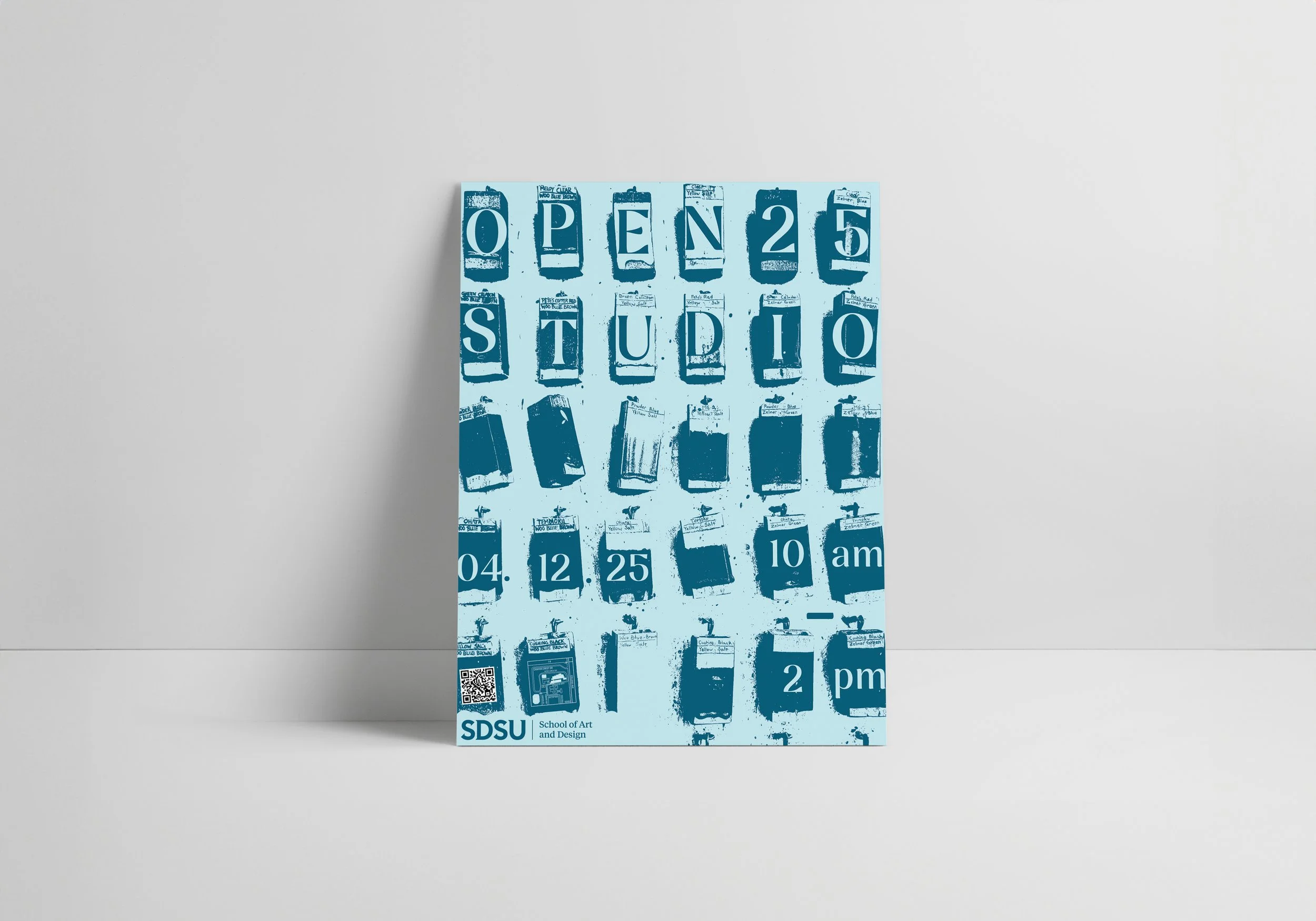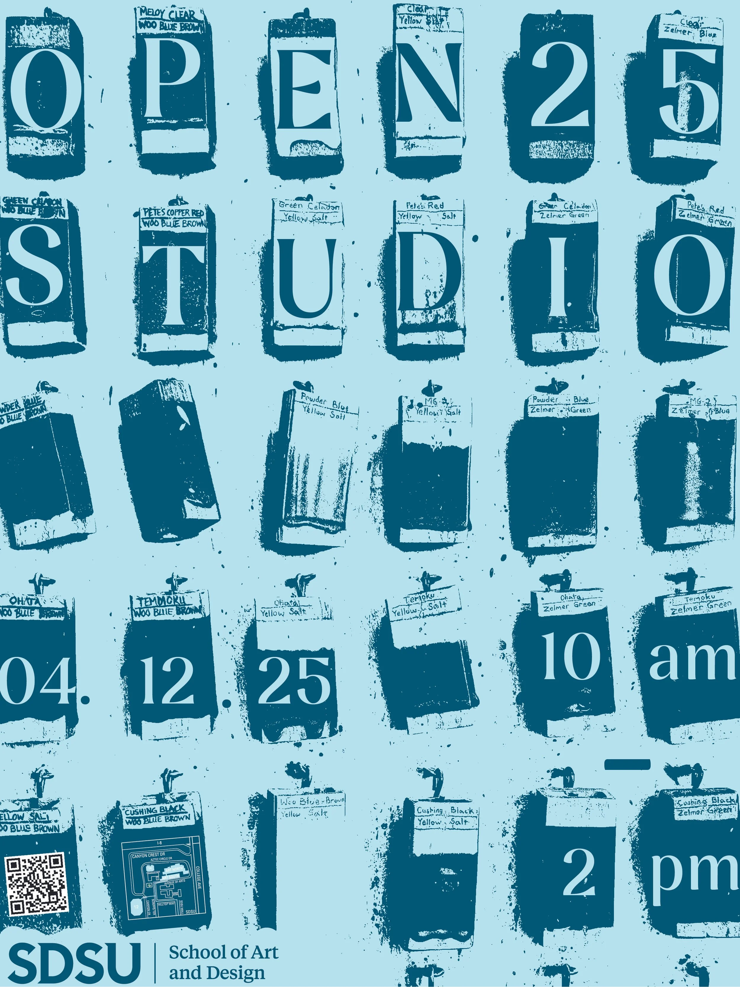

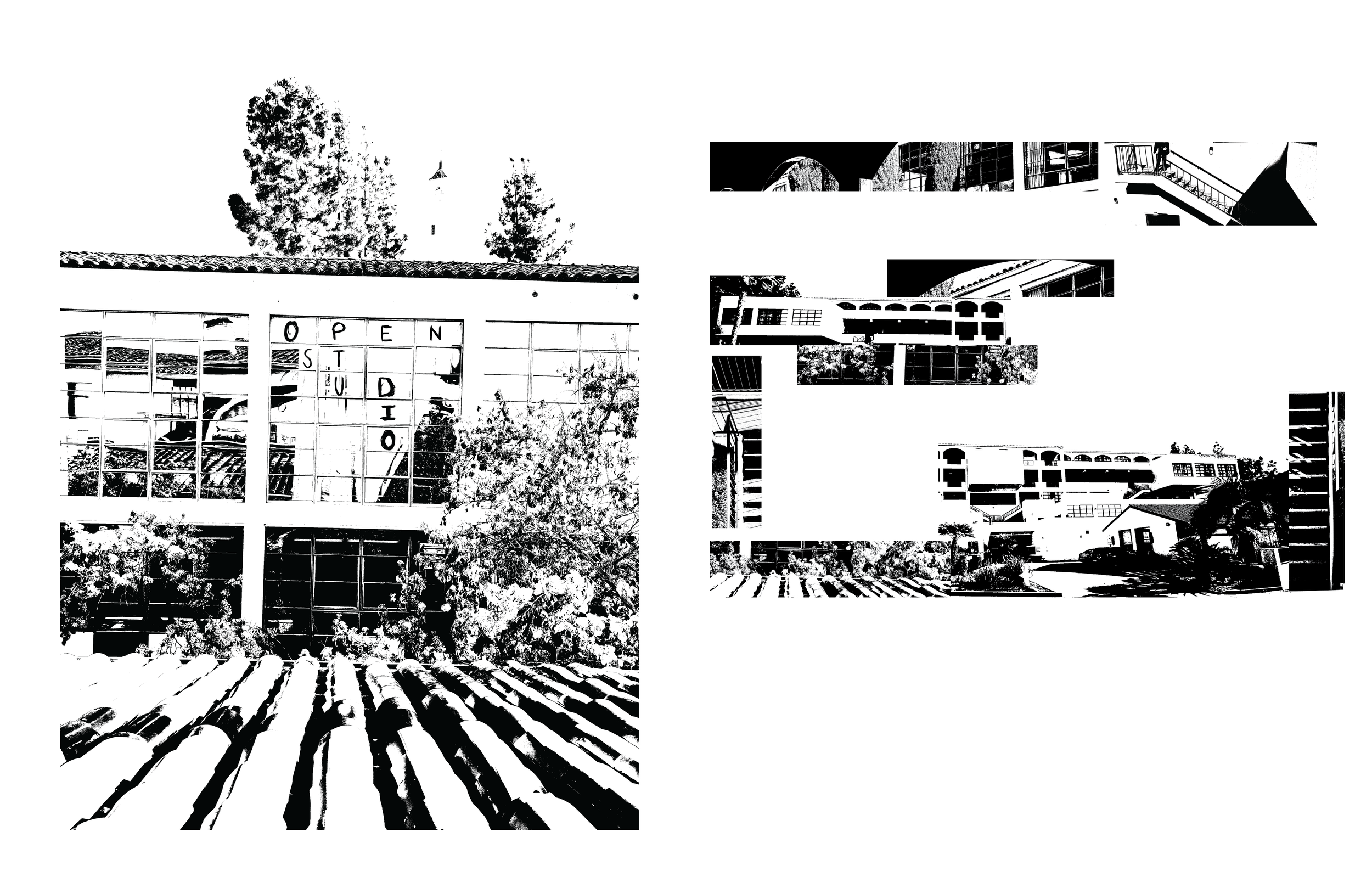
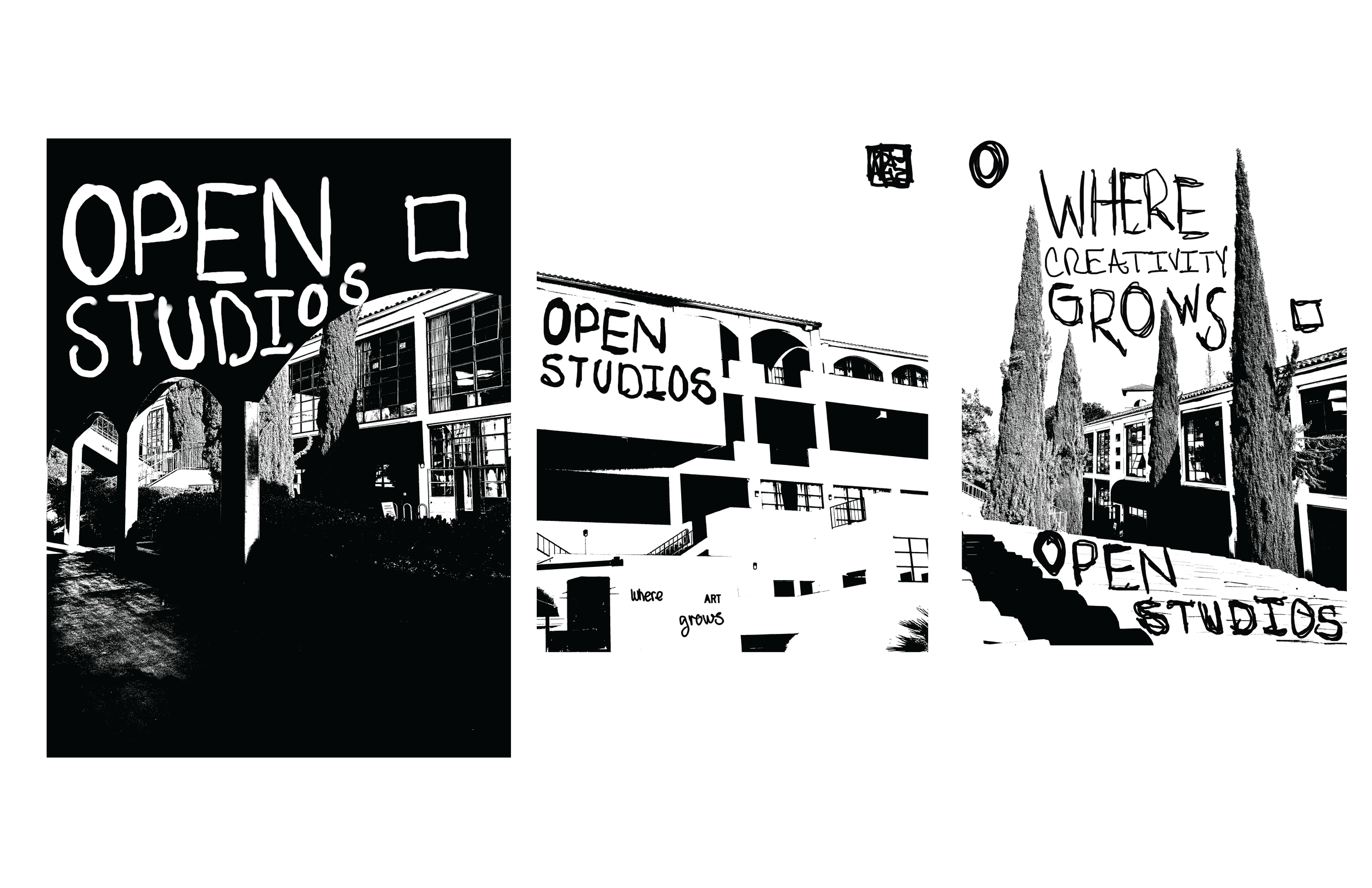
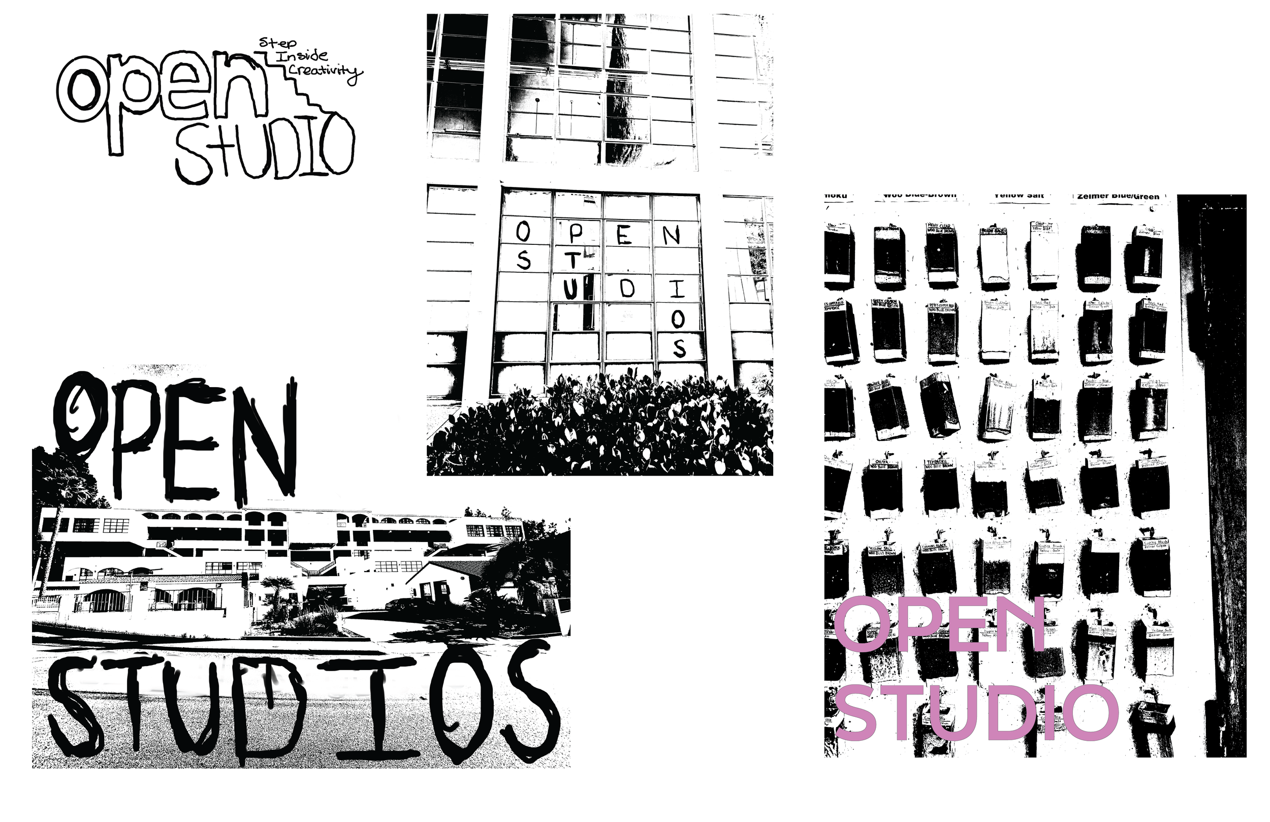
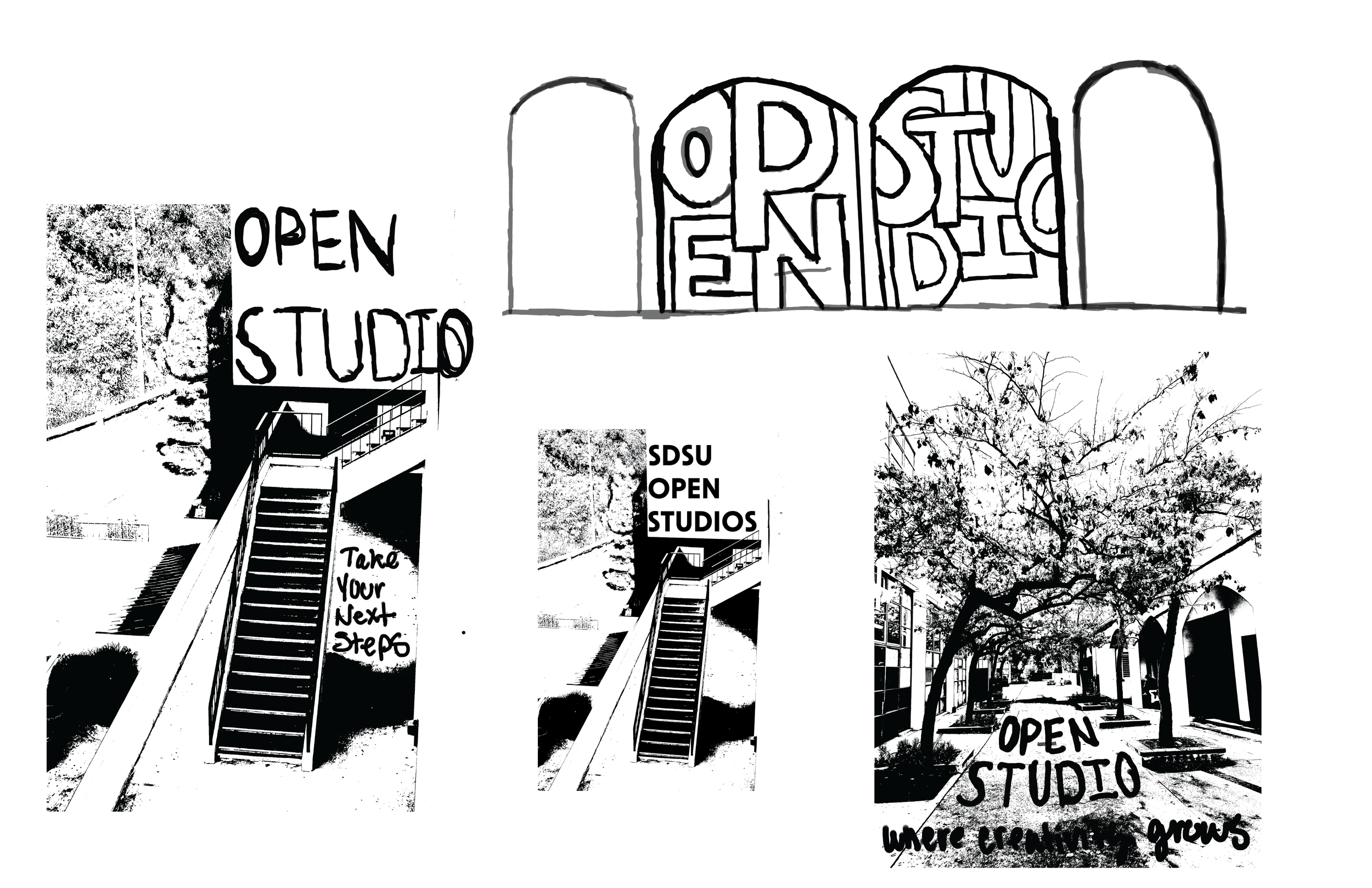
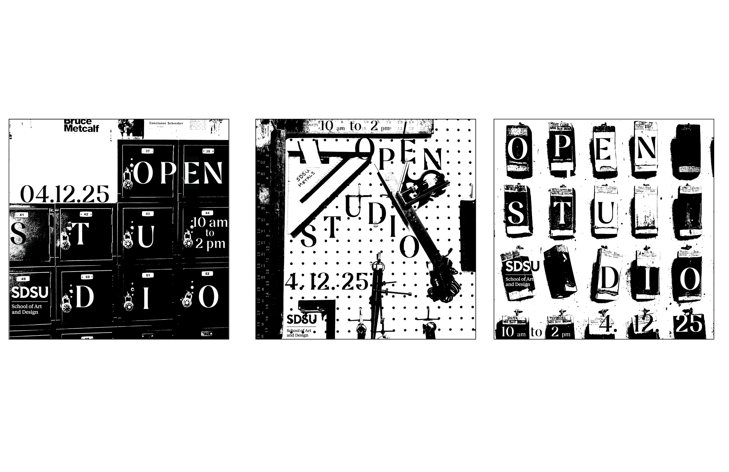
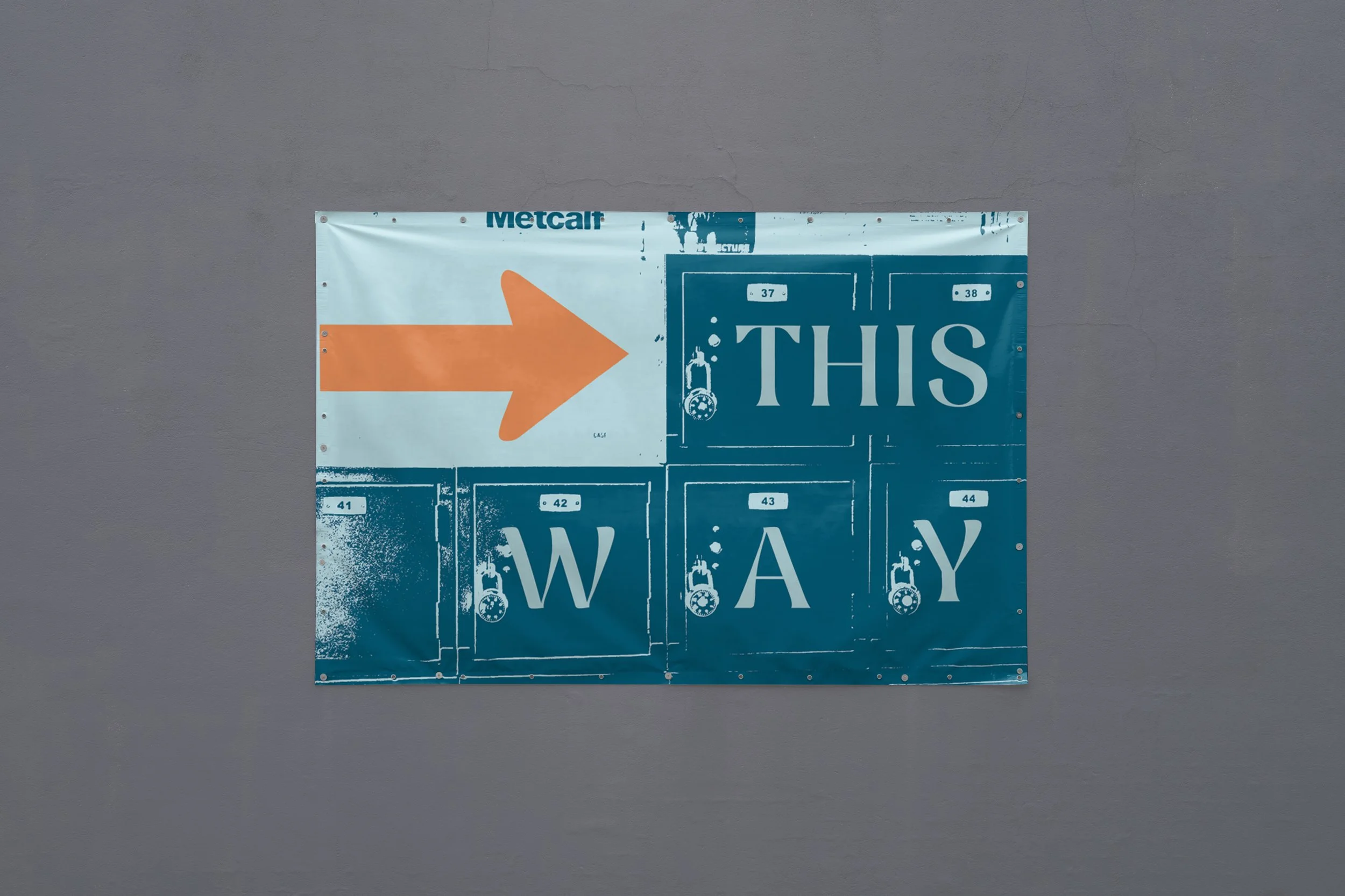
For this project, we were tasked with the responsibility of representing SDSU’s Open Studios event, while drawing in the attention of incoming students. The concept behind my system derives from inside the classrooms and studios of the art buildings. While taking a tour of Art North and South, I captured images within the studios and classrooms, using these as the driving force behind my series.
Design Brief

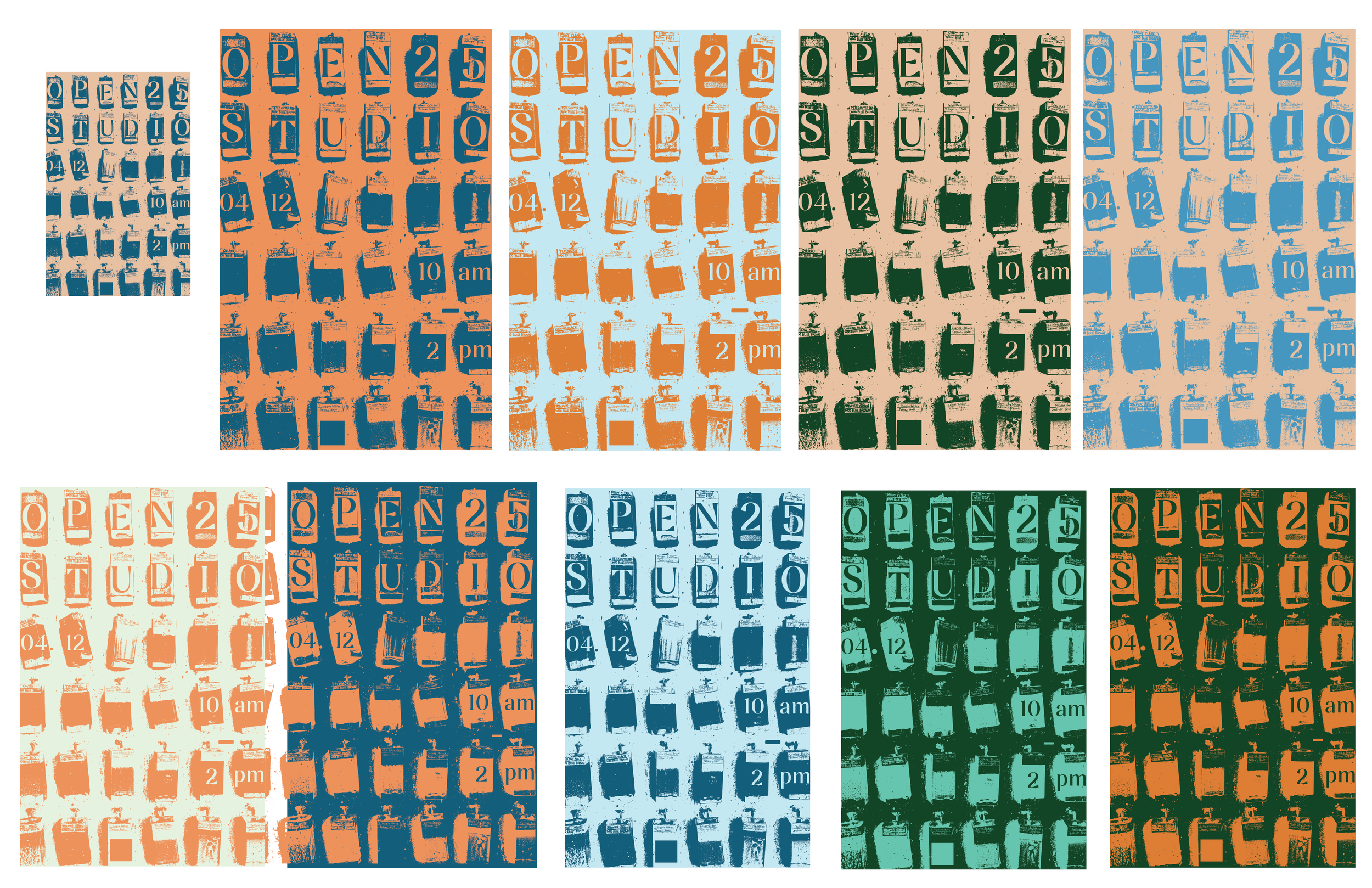
Inspired by past screen-printed projects, I treated my photos with the threshold filter, playing off their grid like patterns. Keeping the series from presenting as too loud, the color palette is a simple three color system, with a light and dark blue and complementary orange. Each deliverable is set in a two-color system, with an expectation to the way-finder, with all three colors to catch the eyes of participants. Using the Nave typeface allowed the high contrast of the design to be carried throughout the information on each deliverable.
Process
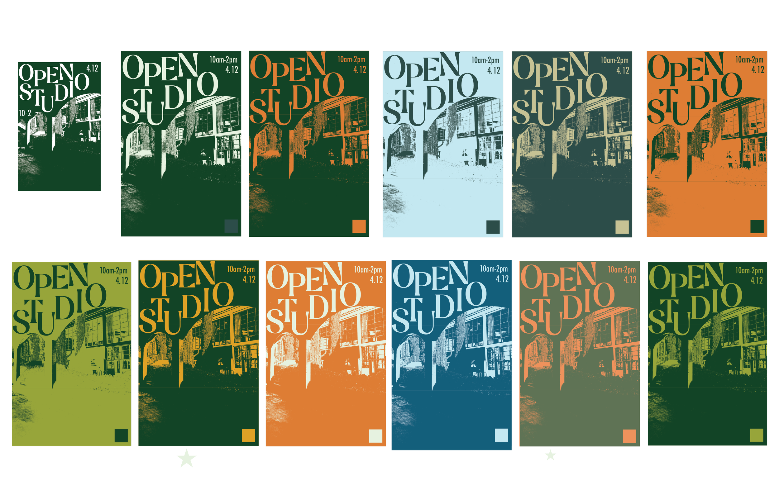
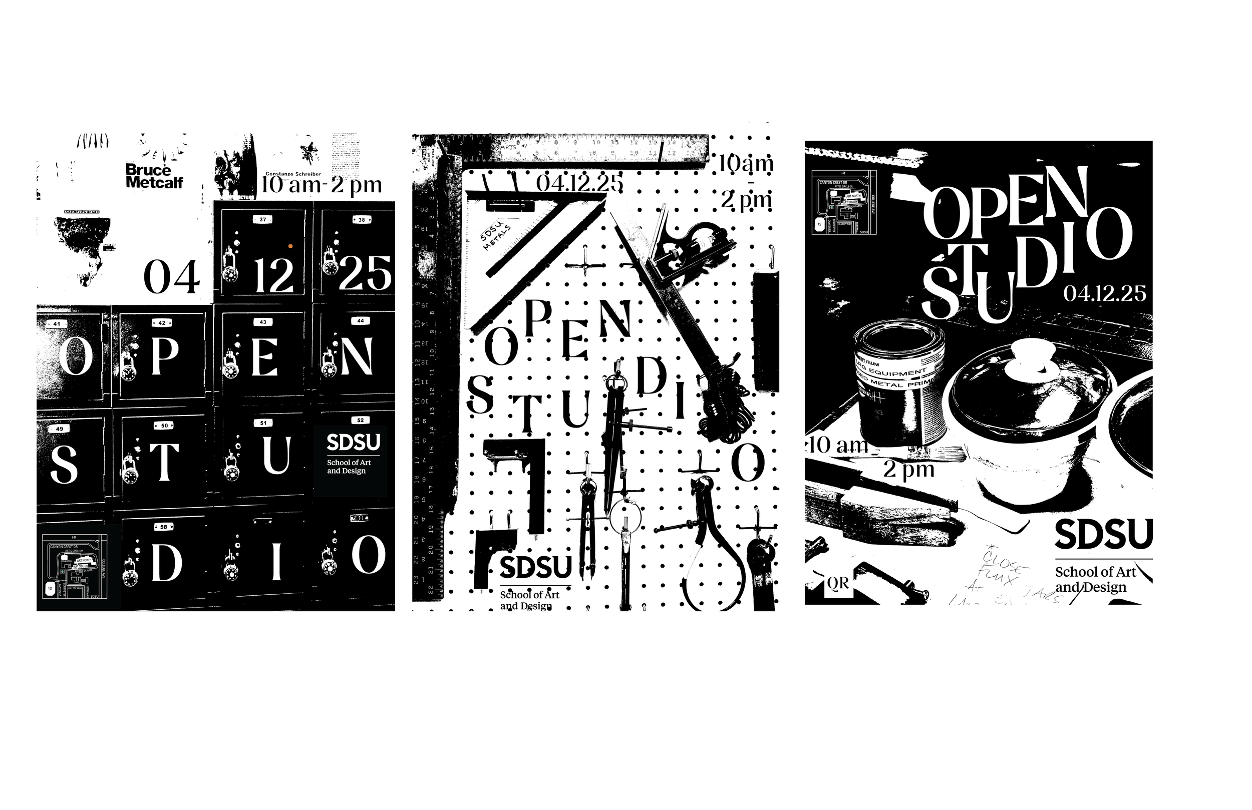
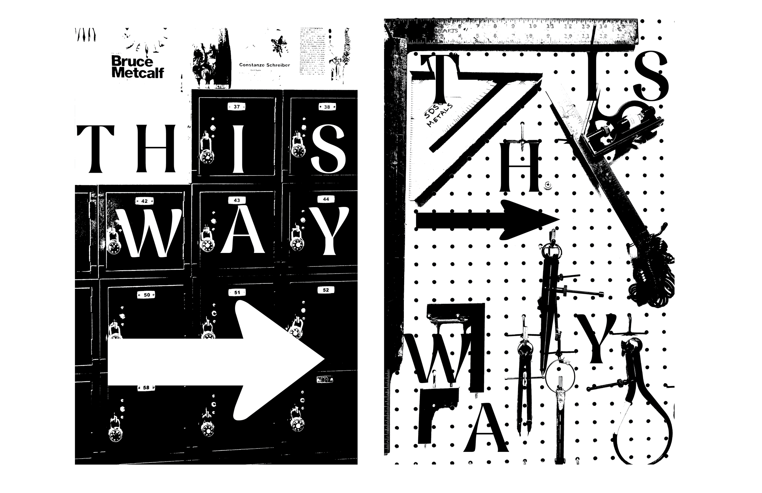
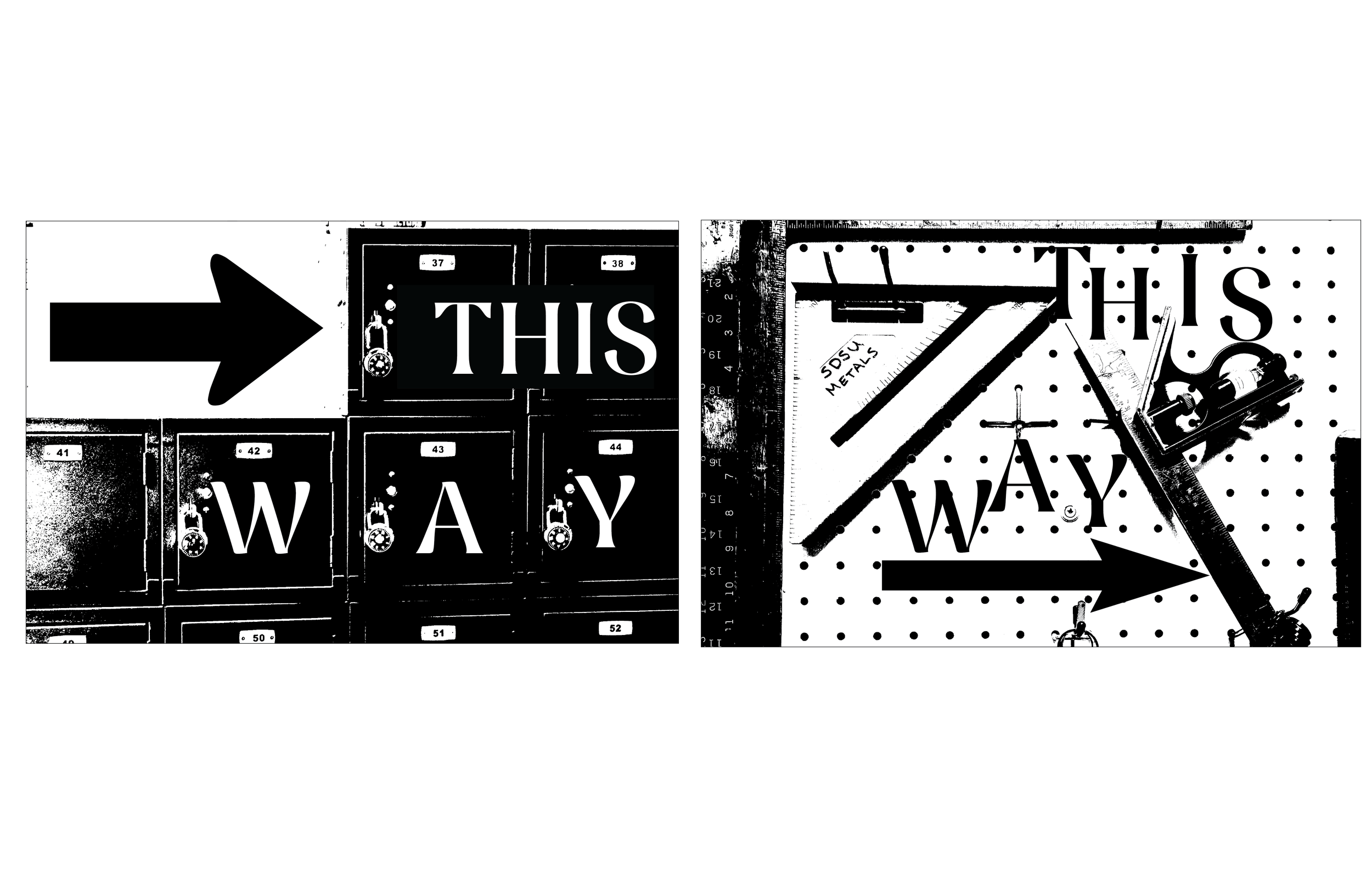
Final Design